When you click the Settings icon, an additional menu will open at the top of your dashboard where you are able to edit your general dashboard settings. Any changes you make here will be reflected in your entire dashboard. In other words, this will be applied to every widget and every tab that is part of this specific dashboard. The settings menu looks like this:
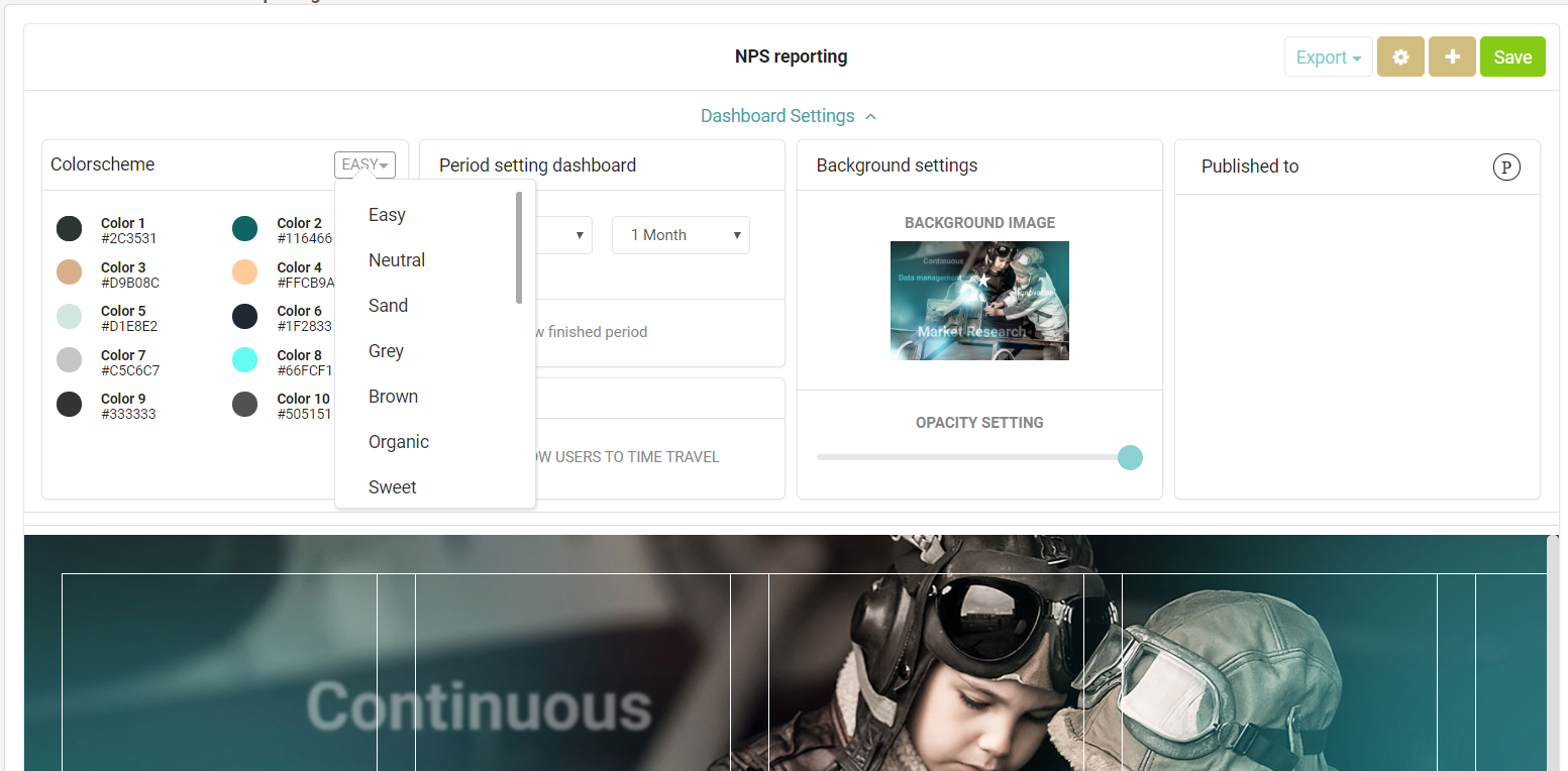
There are four main elements:
1. Color scheme
Here you can choose a color scheme that will be applied to all the predefined widgets that you have added to your dashboard. For any new widgets, the chosen scheme will automatically be applied as the default color scheme. We have already provided you with 8 ready to use color schemes. Simply click the top-right corner of the Color Scheme menu which states 'Easy', and the options will appear.
Besides our predefined options you can also customize the color schemes to match your companies branding or your personal preferences. Additional instructions in how to set this up can be found in our article on Customized color schemes.

2. Period Settings
The period setting of the dashboard ensures that you are able to group your data into periods and frequencies that match your companies reporting style.
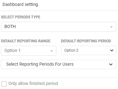
The period type determines how your users treat the grouping of the periods. Do you want them to have access to smart pre-calculated settings like months or weeks? Do you want them to be able to select their own startdate and enddate over which the data is calculated manually? Or both?
If you choose the SMART option or BOTH option, you need to select the project that will determine your period grouping. The date on which the last completed record was entered into the database counts as the basis of the enddate of the reporting period you choose.

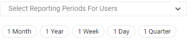
In the dropdown for the Reporting Periods For Users, you can set your preferred periods to be used for grouping your data together (e.g. days, weeks, months, quarters, etc.) If you select 1 month and you use a widget that compares multiple periods, the comparison will be made in months. If you select 1 week, than your widget will present you with a comparison based on weeks.
If you select 1 month and you use a widget that compares multiple periods, the comparison will be made in months. If you select 1 week, than your widget will present you with a comparison based on weeks.

The Default Reporting Period indicates which of the periods you selected in the reporting periods for users dropdown will be used as a default for all users when opening the dashboard
Please note: All dropdowns only show you the allowed years and periods that your administrator has approved and selected on portal level. For more information on how to set this up, read our article on Reporting Periods.
Underneath the dropdowns there is an additional checkbox for your period settings:
Only allow finished periods - when checked this will ensure that only data for completed periods are included in the dashboard. For example: It is now the 18th of October. You have indicated with the dropdown that you want to use a period grouping of 1 month, and that you only allow finished periods. This means that the most recent period reported in your dashboard is the month of September. The records of October 1st - October 18th are not reported yet. As soon as it becomes November 1st, your dashboard will be updated to include the month of October.
3. Background settings
By default the background color of your dashboard is white. You are able to set a background image by selecting one from the media library. Simply clicking on the pencil icon will open up the media library to make your selection. The image will fill the background of your dashboard, so be sure to use an image that is suitable to be enlarged.
The picture that you choose will be applied to your entire dashboard. So if you decide to add multiple tabs, every tab will have the same background image.
Opacity settings - Underneath the background image you can set the opacity for your widgets. Low opacity will give your widgets a mostly white background, making them stand out more. A higher opacity will make your widgets more transparent, so your background image will shine through for a branded look & feel.

4. Published to
In this tab you can add groups of users that are able to view the dashboard that you have created. The groups that are presented here to choose from are reflecting your companies set-up of groups under User management.

And that's it! You have now edited the overall settings of your dashboard and you are ready to start adding your widgets.